The advent of new technology and social media brought with them the emergence of new styles, new shapes, which were ever more minimal and more modern.
In the wake of these changes which occurred over this two-year period we implemented major changes to both our brands.
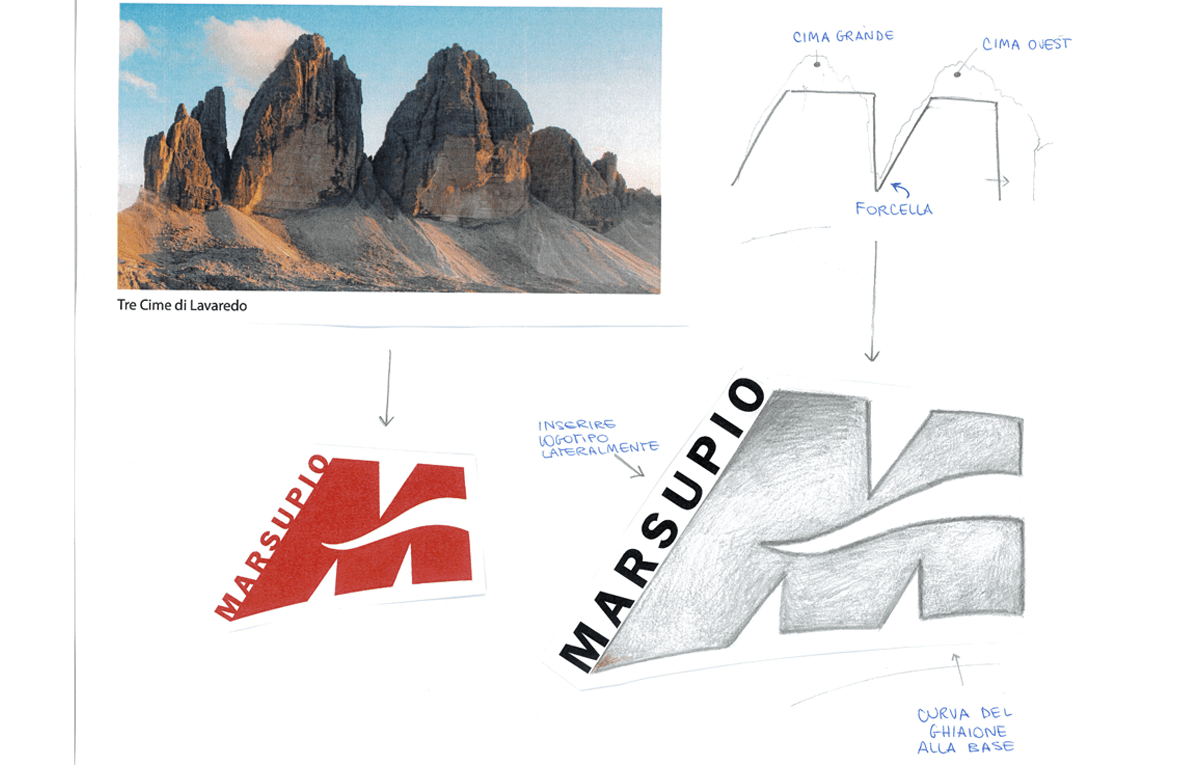
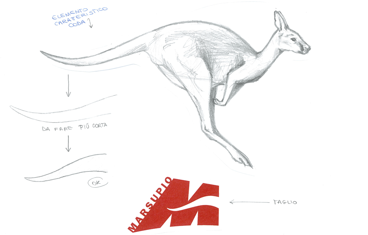
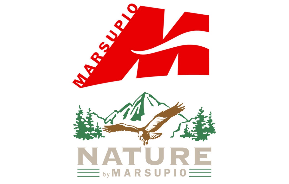
Starting from 2007 with Marsupio, we wanted our corporate image to be contemporary but to firmly reflect our roots at the same time. With this in mind, we’ve maintained our kangaroo emblem, but just as a silhouetted tail which cuts across the ‘M’ of our logo. We’ve also kept the concept of mountains and nature, with the ‘M’ shape being reminiscent of mountain peaks, inspired in particular by the iconic Tre Cime di Lavaredo Dolomite mountain group.
This natural scenery, unique in its kind, is also located inside the Dolomites.
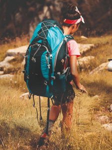
This was a very important aspect for us, and we wanted to build our image on it, because our company was founded in the heart of Veneto and it’s really close to the value sphere of our territory.
In the following year, 2008, we also gave the Nature by Marsupio logo a facelift, maintaining the original elements such as the mountains, the eagle and the trees, but with a more minimal, linear design, more in keeping with the style of the times.
Also in this year, we started publishing a separate catalogue for our Nature by Marsupio line, with many technical hunting and mushroom foraging backpacks that we’ve updated over time, and which remain in our catalogue to this date.